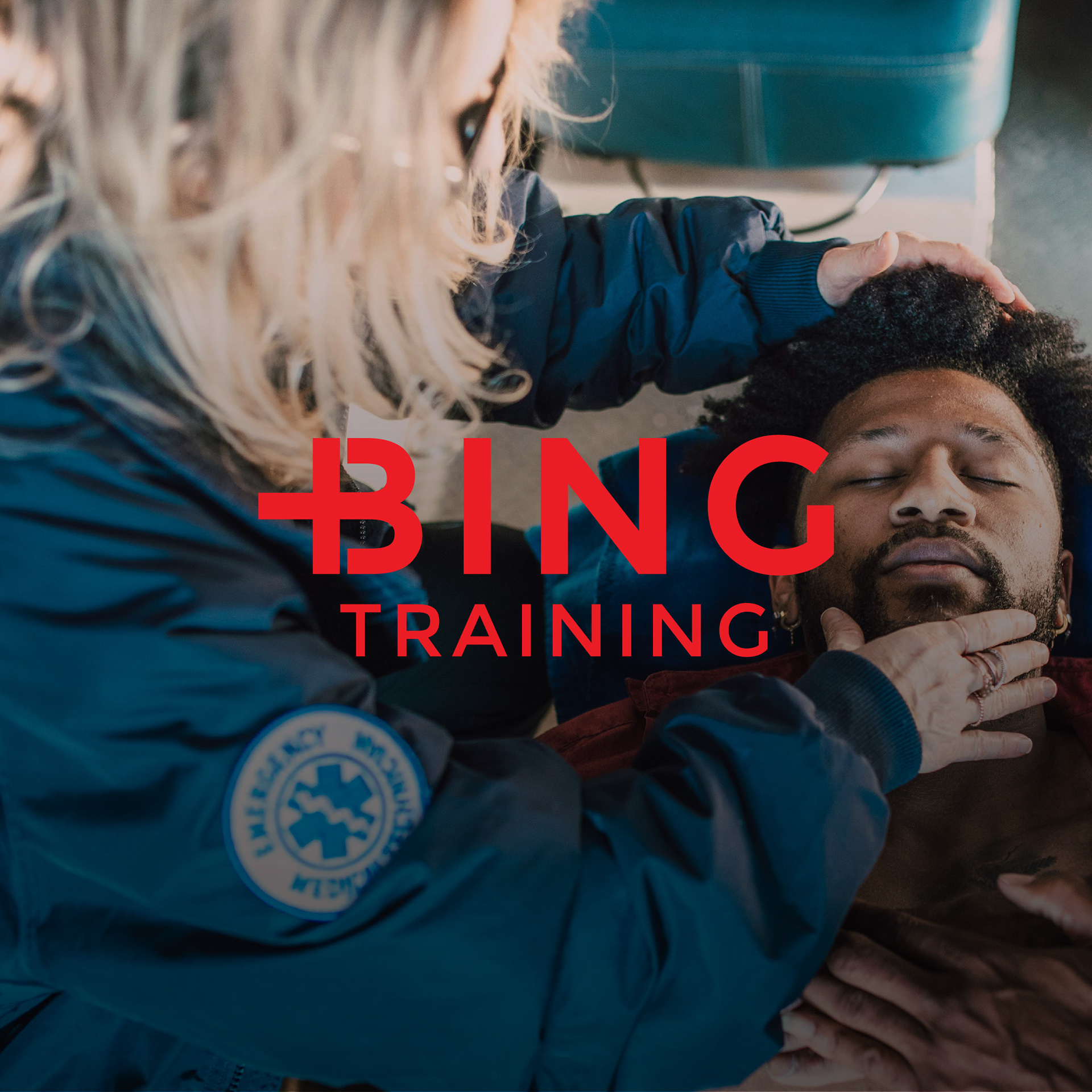

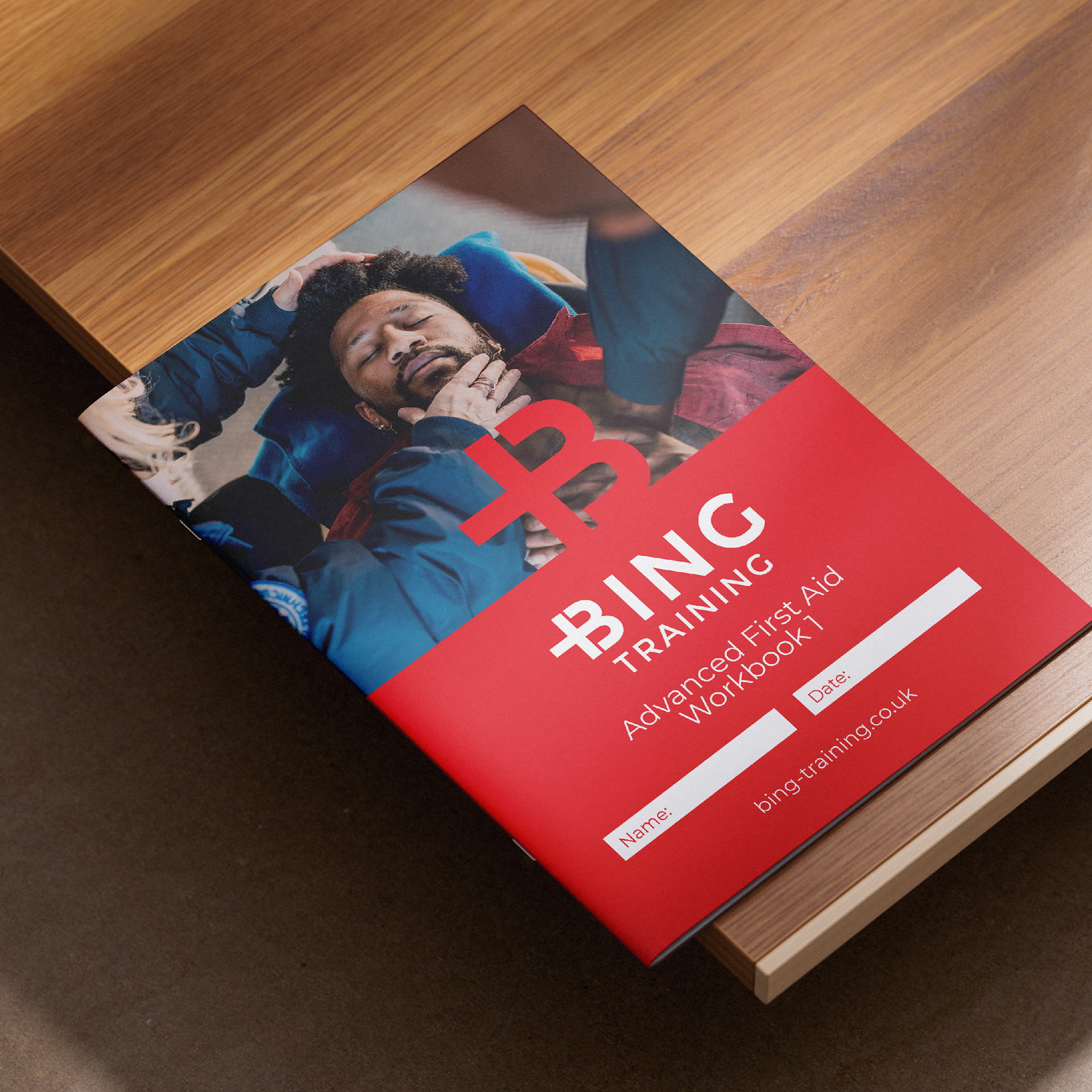

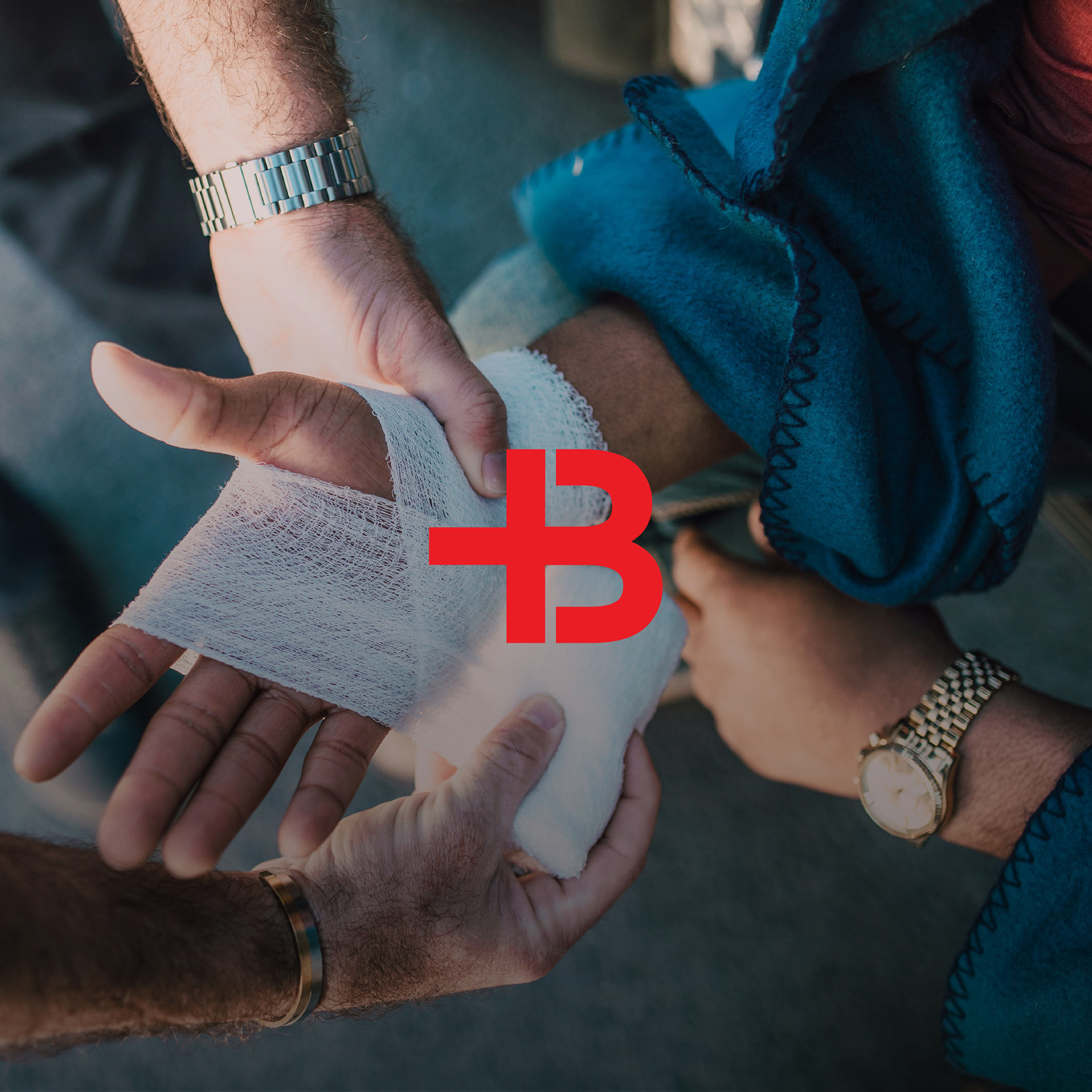
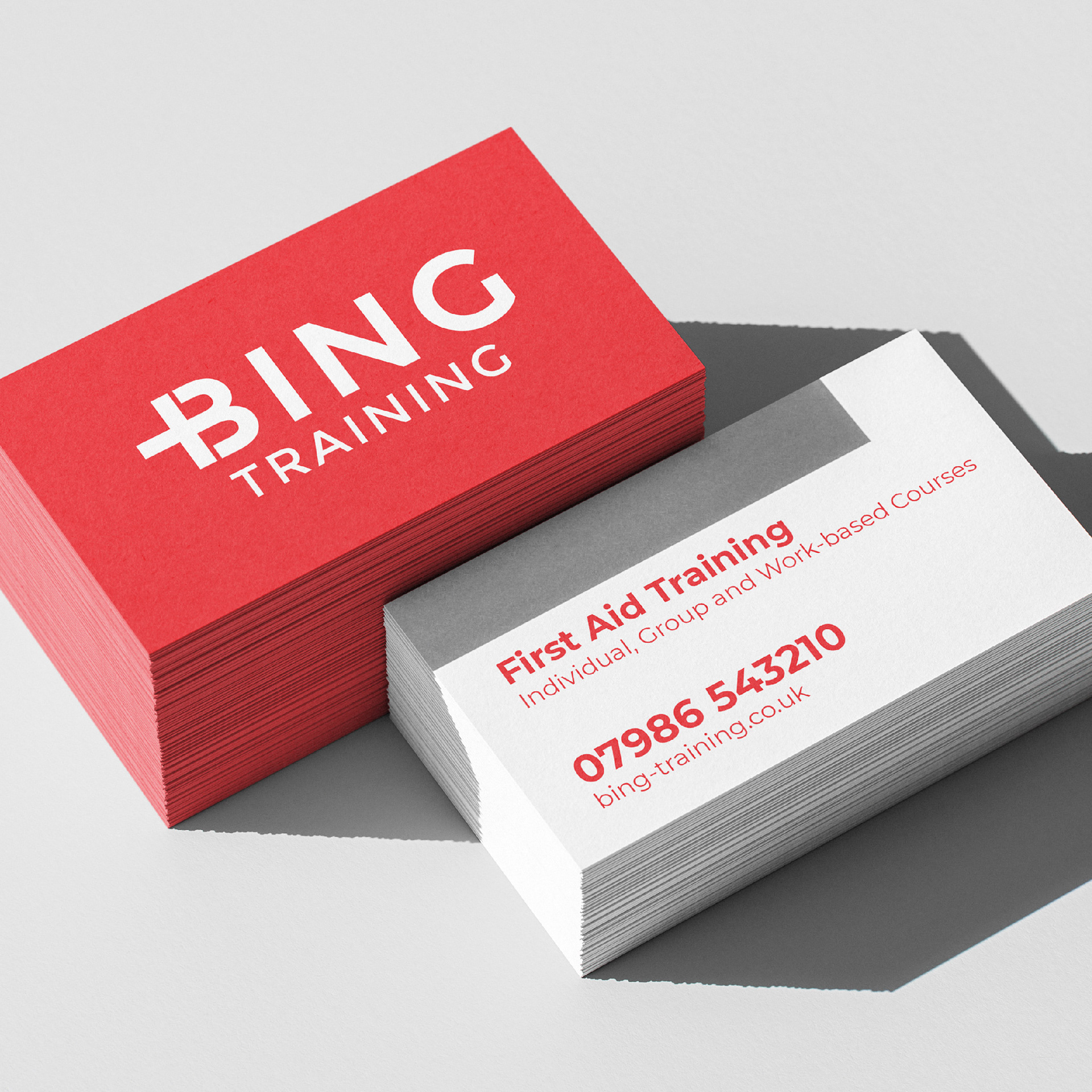

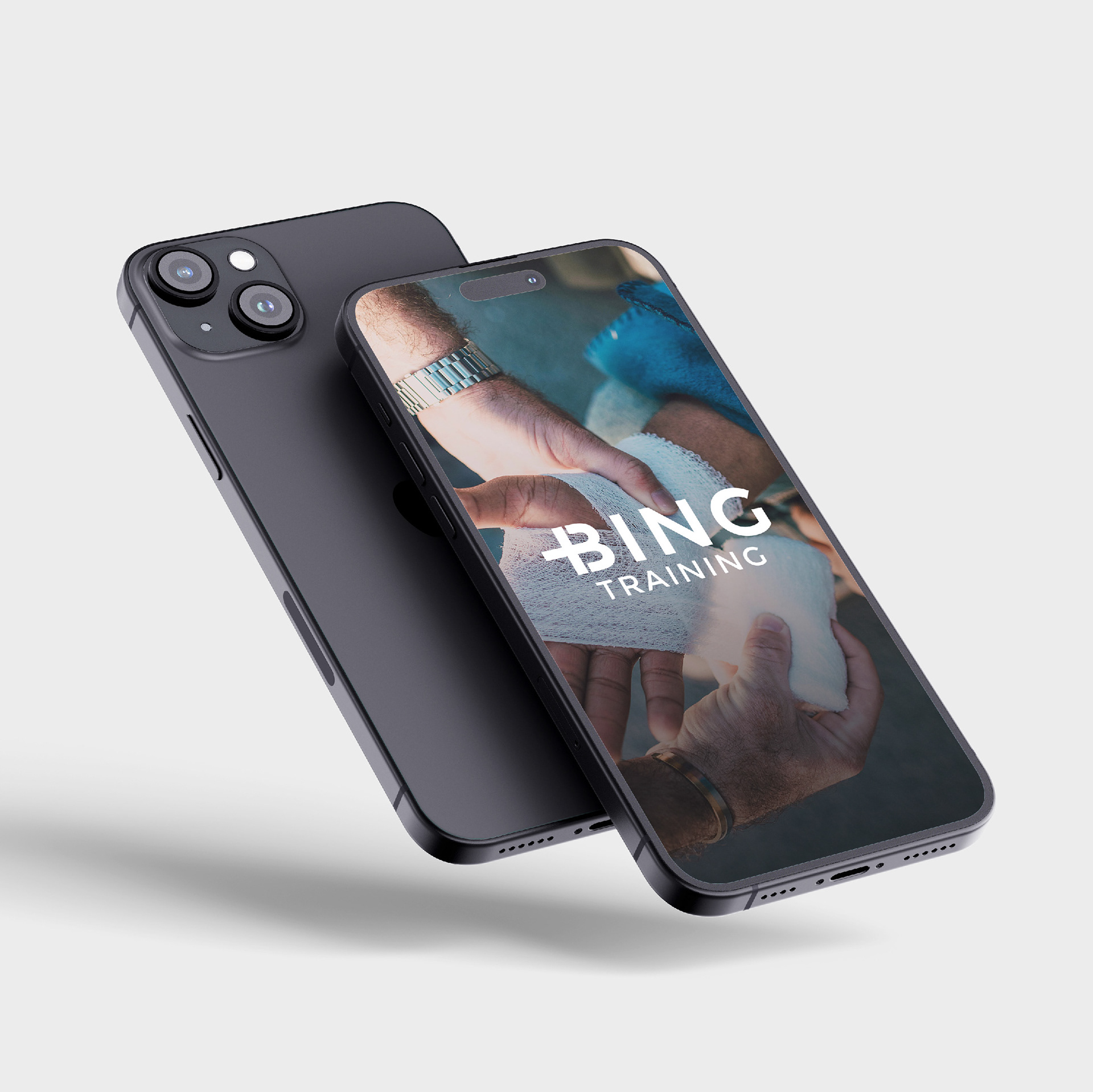

A professional first aid training provider, I created a brand identity that reflects trust, clarity, and approachability. The goal was to design a brand that conveys both the seriousness of life-saving training and the accessibility needed to engage a wide audience, from individuals to corporate clients. A clean, modern logo with subtle medical and instructional cues reinforces Bing Training’s expertise in first aid education. Typography and design elements are structured for clarity and professionalism, ensuring that all materials—from course guides to digital platforms—are easy to navigate and visually engaging. This cohesive branding extends across all touch-points, providing a polished and recognisable identity that enhances credibility and engagement. With this refreshed brand, Bing Training is positioned as a trusted leader in first aid education, empowering individuals and organisations with the skills and confidence to respond in critical situations.